Maebo Noodle Factory One Ton Packaging Concept
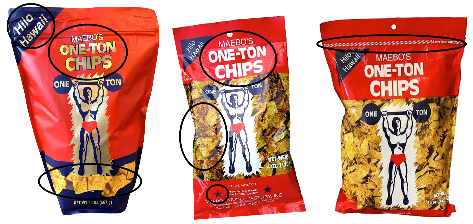
Maebo’s existing packaging lacked consistency across different product sizes, with variations in typography, strokes, spacing, and graphic elements—even for the same product. The challenge was to create a cohesive packaging system that strengthens brand recognition while preserving the familiar character and heritage of Maebo Noodle Factory.
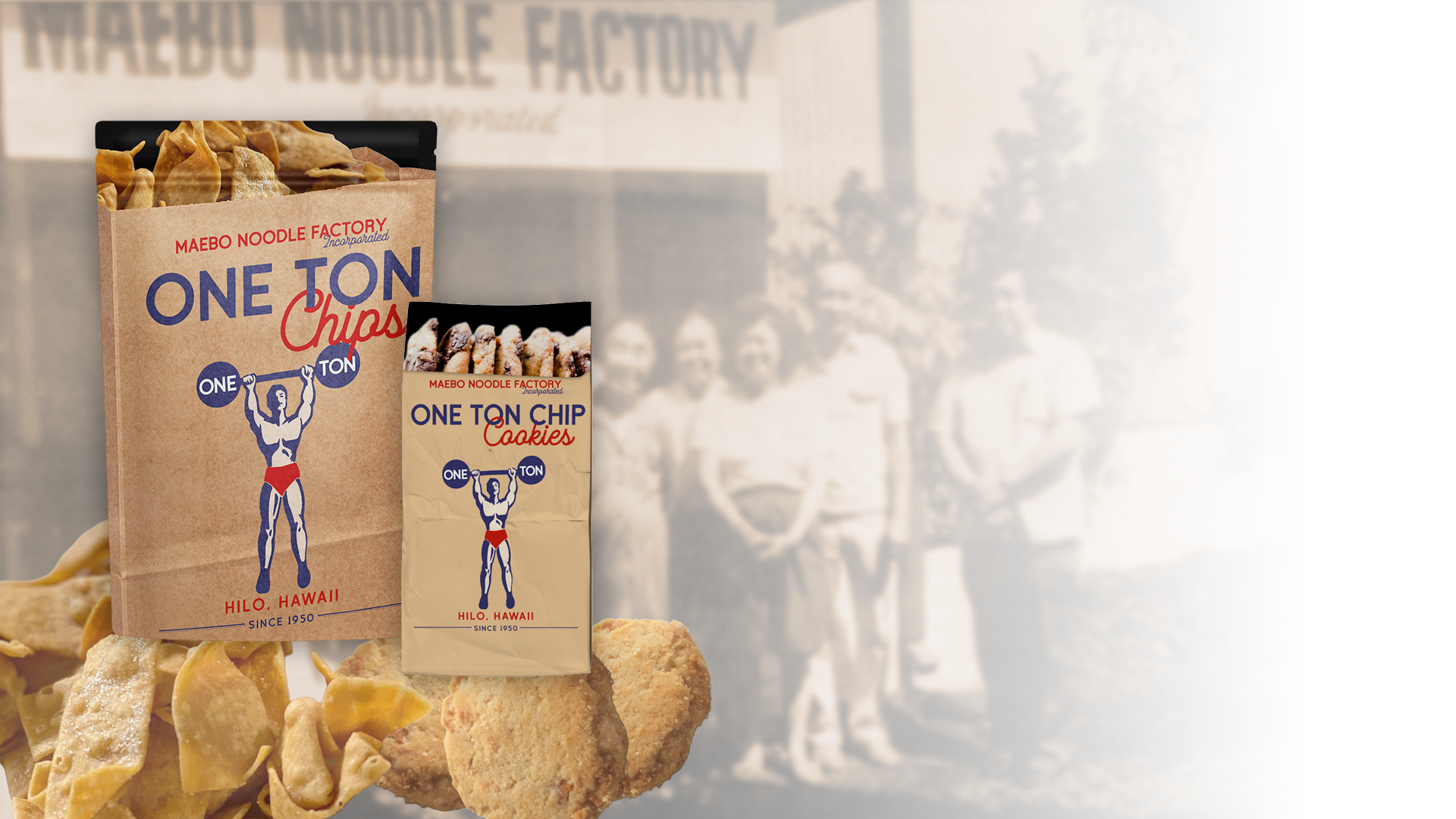
Imagine walking past Maebo Noodle Factory in old Hilo town, the smell of fresh chips frying drifting out into the street. Grandma Koto hands you a simple paper bag—still warm, perfectly crisp, and filled with enough to munch on the walk to school. A little taste of Hilo, just like you remember.
Concept 1
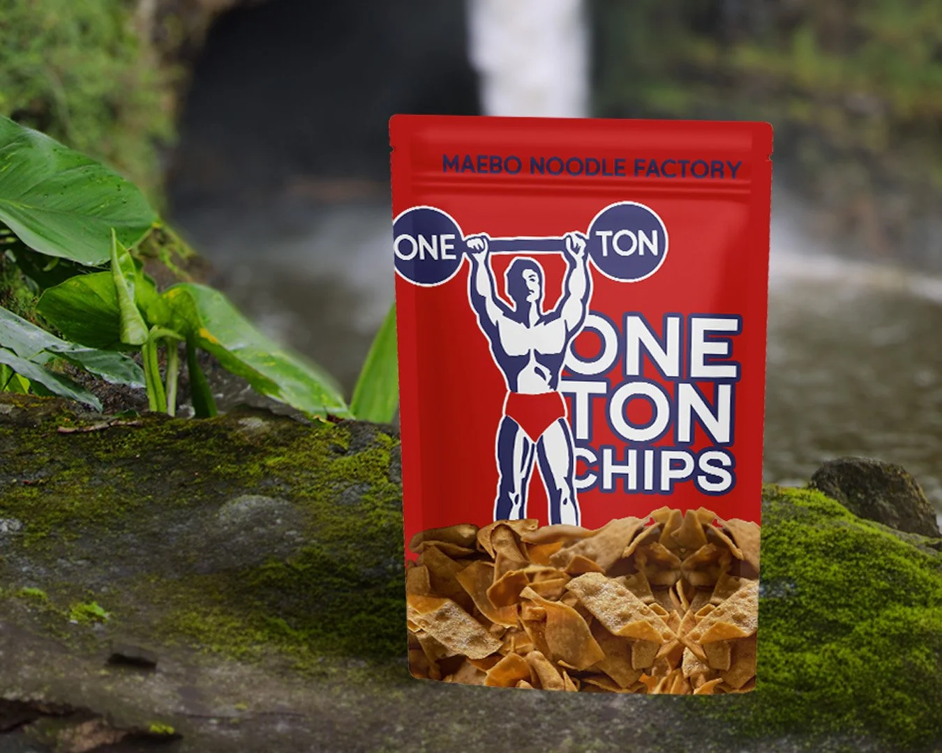
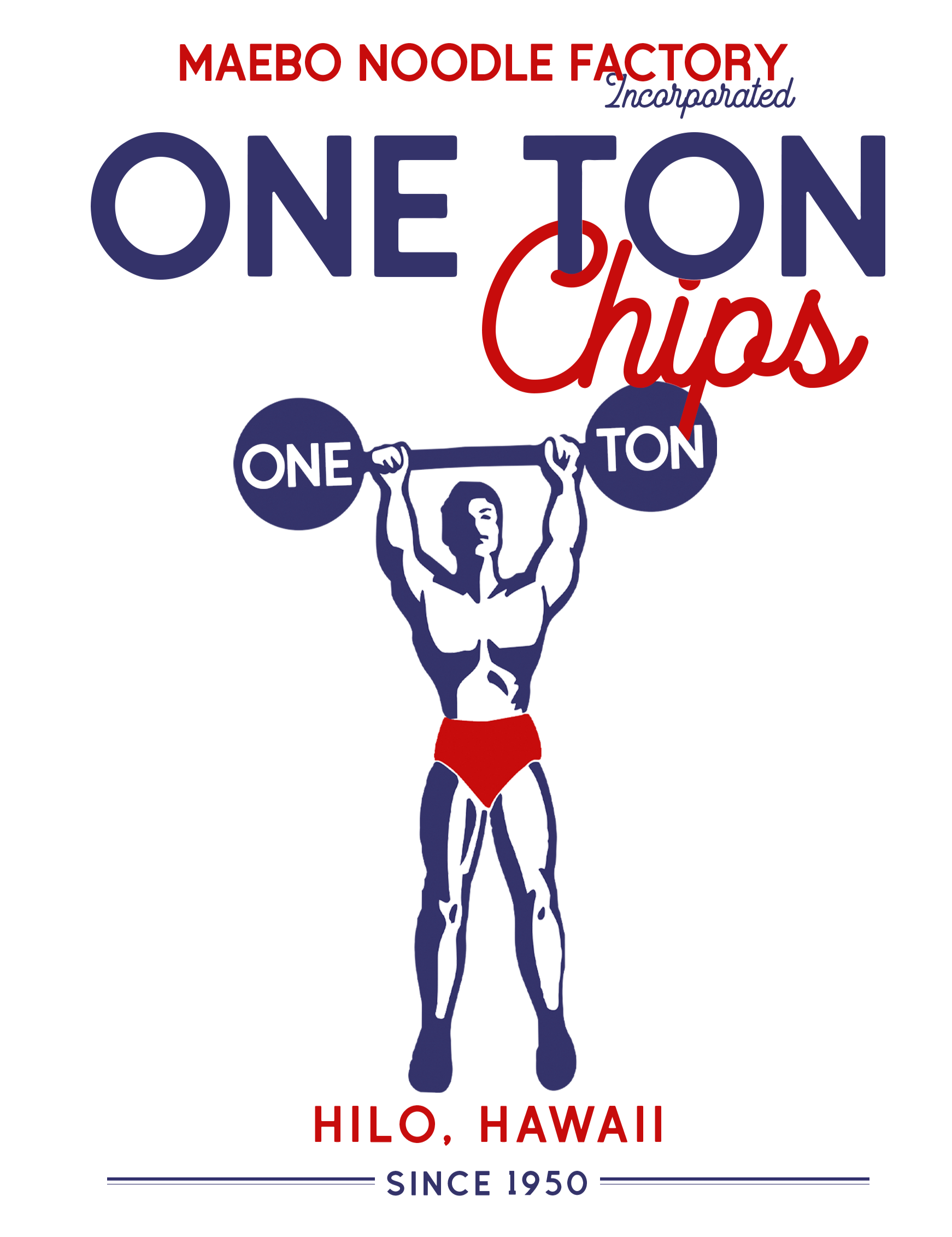
The concept pulls from the history and nostalgia of Maebo Noodle Factory while giving the brand a refreshed identity. The original logo is thoughtfully updated, paired with typography inspired by the factory’s vintage Hilo signage. A paper bag texture brings back the feeling of fresh chips handed over the counter, while actual product imagery spilling from the package keeps the design honest, recognizable, and unmistakably Maebo.
Concept 2
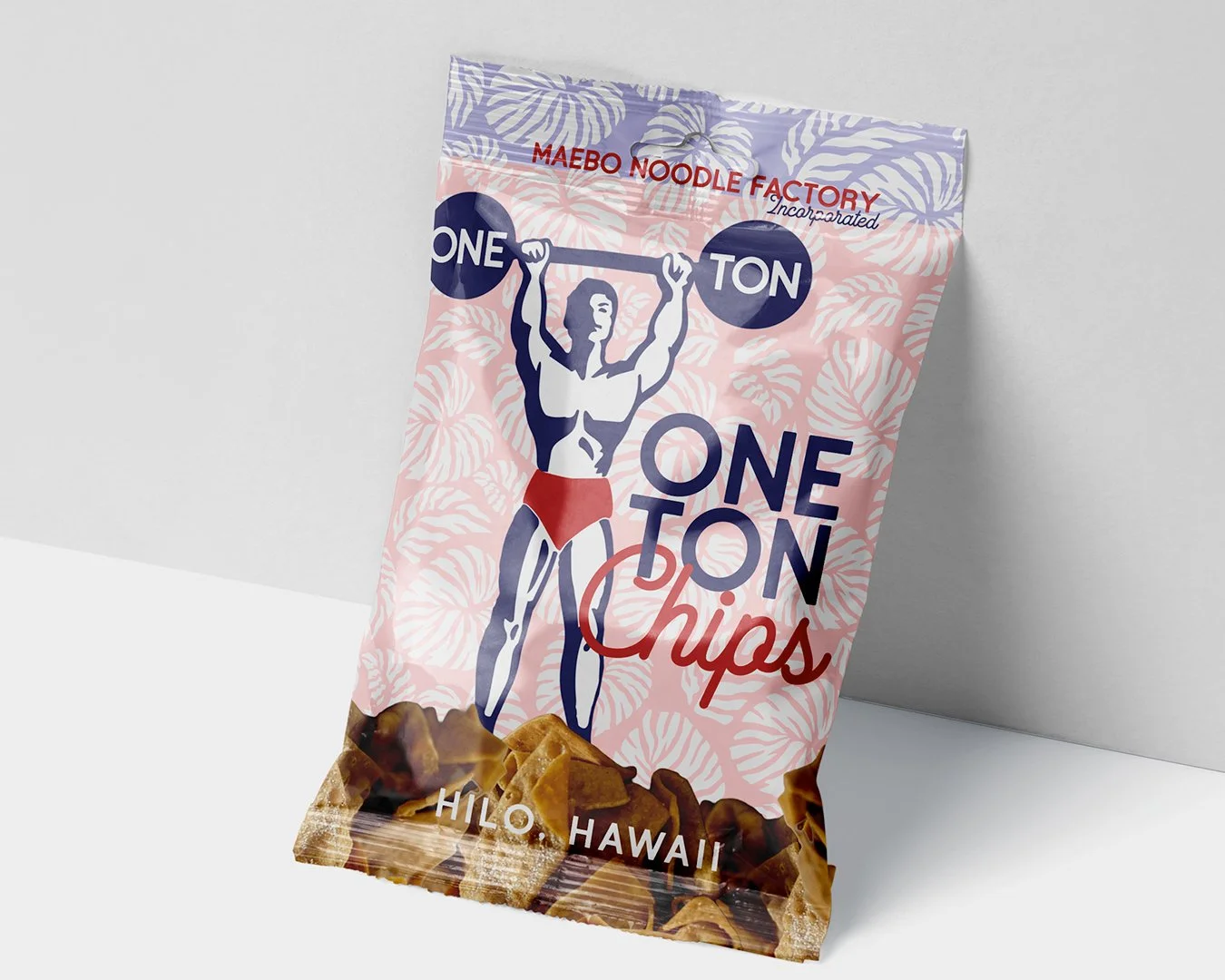
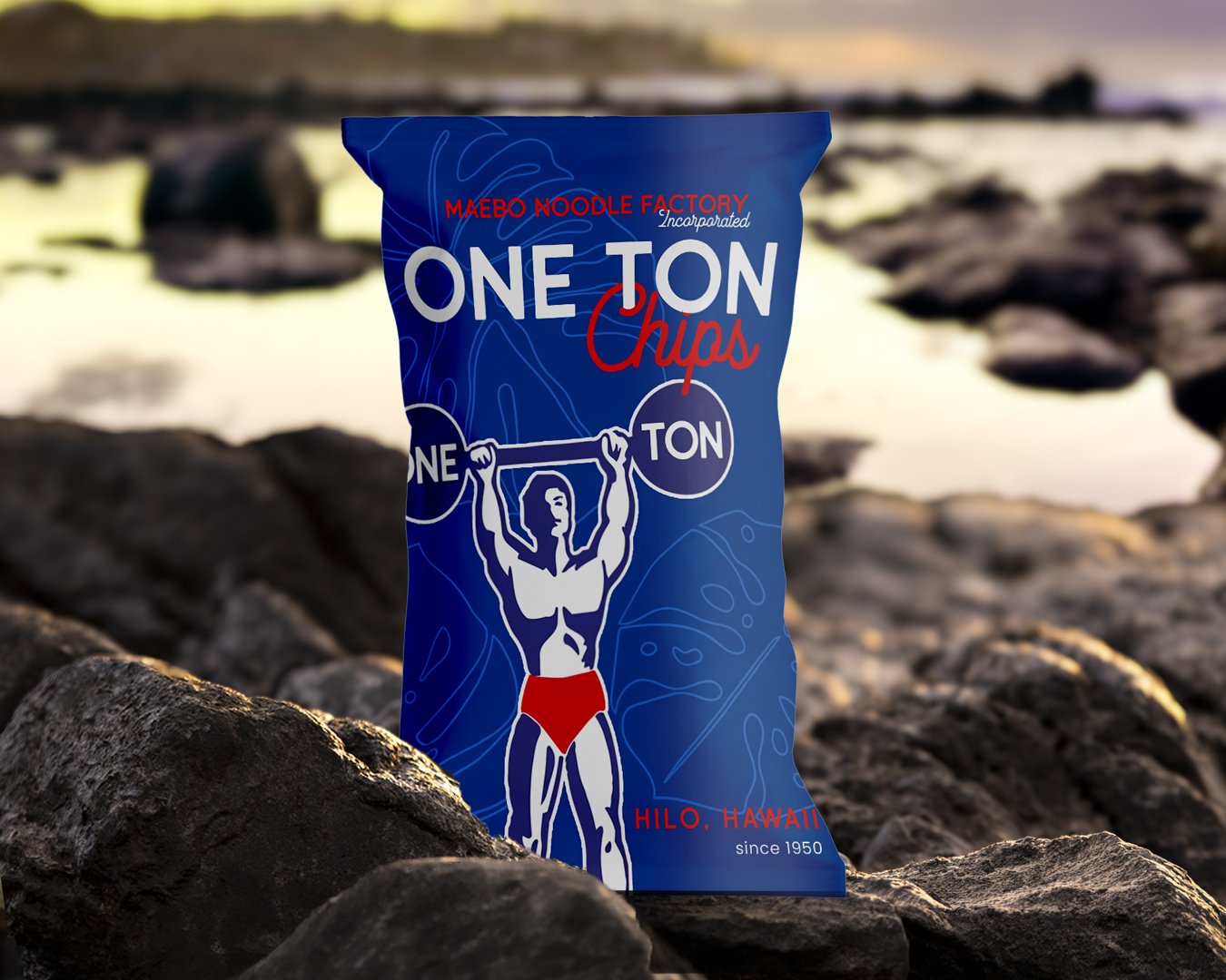
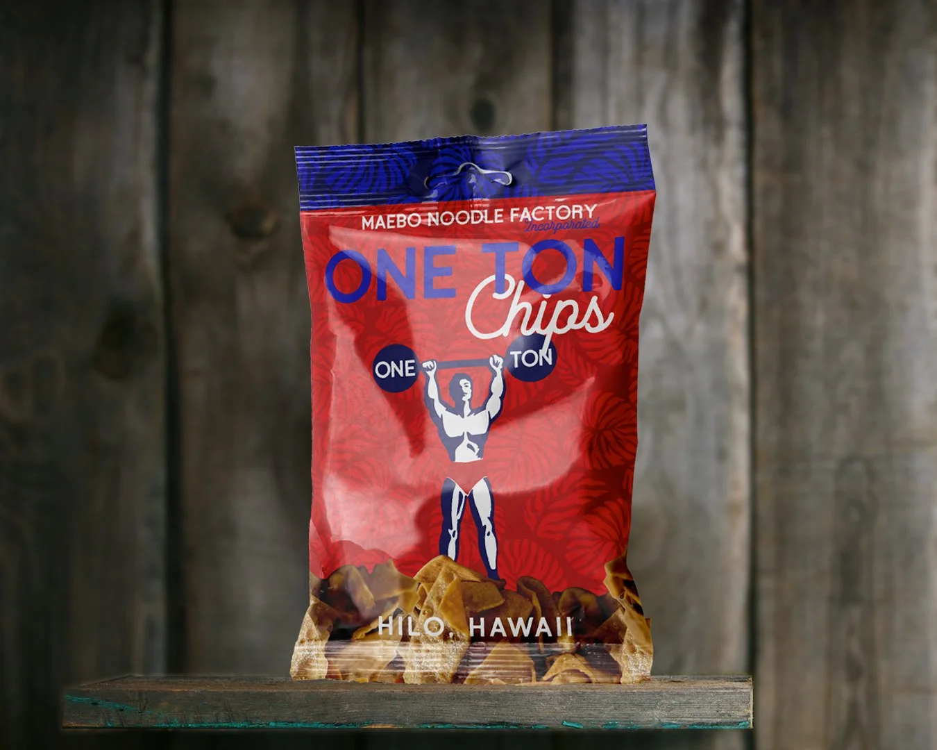
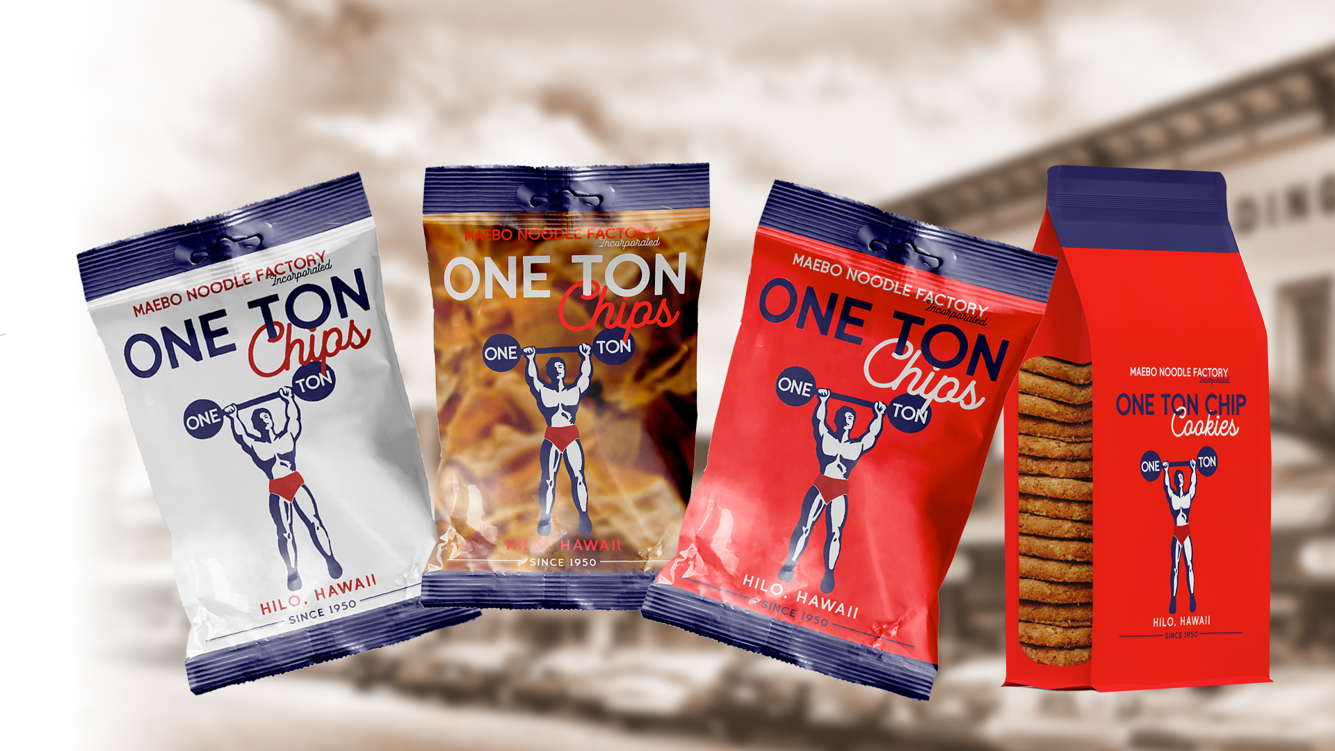
Inspired by vintage snack packaging, this concept reimagines Maebo through the look and feel of an earlier generation. Retro typography, simple graphics, and nostalgic packaging details celebrate the brand’s long history in Hilo while giving the bag a fresh, collectible feel. It’s designed to look like something you might have pulled off the shelf years ago—familiar, local, and unmistakably Maebo.